How Google’s new logo (FUCS) changed my life?
Disclaimer: I spend a lot of my time online and hence any change in the online space impacts me hugely (compromises on the family time but who does not want to be digitally connected, family is always there for you).
Disclaimer 2: Its called FUCS for a reason. Read on.
So Google changed their logo a couple of days back. If you are not aware of this, I need to question your existence or your intellect or your motive in life. You didn’t even have to google it, the video on their home page said it all, beautifully created by their agency, a hand erasing the old logo and then a hand with crayon drawing the new one. It was epic and a different level of creativity and don’t even have second thoughts on who is winning at Cannes this year.
So what has changed?
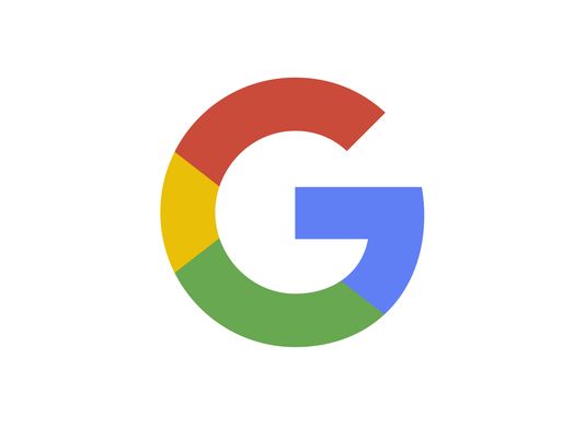
The font, you idiot, how could you not notice such a big change (life changing for me, explained later). Google calls it friendly, uncluttered, colourful, simple (FUCS for short and that what it would be referred to in the rest of the post). So the FUCS logo is the design of the future as quoted on their official blog. They say it will look the same across all devices and interfaces (wait it looked the same earlier last i noticed, may be I am a fool that i could not understand this deep rooted thought behind the logo change for which Google corporate brand team and their agencies would have brainstormed for hours and days and months and the agencies would have worked extra hard to change the font and would have charged a few million dollars to execute the same). (Just realised i put too much text in the last bracket, may be it was not needed, what do you think).
Now the change has happened. I can’t do anything about it, have to live with it, nor can you do anything about it unless you are a south Indian engineer from IIT (did you get the pun, it was a smart one).
So how has the FUCS impacted my life? (one has to look at positives to move ahead in life. I can condemn the move and sulk about it but it is only I who would suffer, so I accept the change).
- My eyes do not get strained: The new Google font is so smooth that I can look at it for hours and my eyes stay fresh. (There is no one “Google logo font.” But, Google’s new logo is based on the new font, Product Sans.) Why was this not done earlier is my question. Have missed out so much in my life.
- My life is more colourful: How could you not notice the 4 colour logo. Yes it has always been there but now it is in the G of google and the logo is now in capital, life could not be better. My mood is now upbeat all day looking at all the colours in their logo. I am sure you are also feeling the change.

- My business has grown: Given that the mood is upbeat and the logo has changed, the fonts are smoother, the logo is colourful, the results shown are much faster and more relevant now, thanks to the logo change. Within a week of this amazing change, my business has started growing.
Thank you Google for changing my life with that logo change. Next time when you are coming up with the change, keep me posted, I will buy your stocks and your agencie’s stocks to become rich.
FUCS rocks.


You Said